
|
|
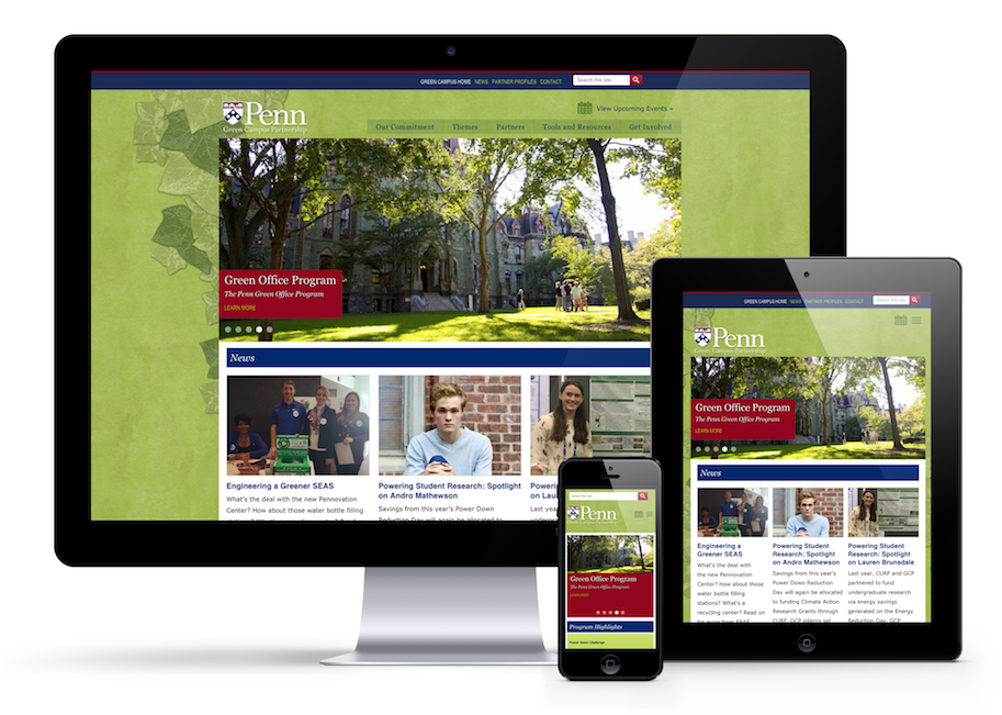
Over the past month, 4x3 has been working with the Penn Green Campus Partnership to redesign their website. They have a Drupal powered content management system which now allows the site to be responsive on all mobile devices. Update & Improve Your WebsiteA website “redesign” doesn’t necessarily mean that you completely scrap your old website and start anew. Brand and identity can stay the same, along with other design elements. But as your company and technology both evolve, it is necessary to update CMS software and out-of-date design modifications.
One Website, Many DevicesResponsive design makes a website easily adaptable to fit the screen sizes of any mobile device. With an on-the-go lifestyle that many of us lead, it is no surprise that most websites have a high mobile usage rate. A responsive design makes it possible for visitors to navigate your website easily across all unique devices, providing a great user experience. Responsive DesignResponsive design is a necessary feature for any modern website. In fact, Google has a new mobile friendly test that can inform visitors if your site has a responsive design. This can inevitably affect your website's credibility, local SEO, click-through rate and lead generation. Google has even gone as far to state that responsive web design is its recommended mobile configuration for any website. Visit 4x3 to get more info about our services »Contact us if you are interested in implementing responsive design on your website. |