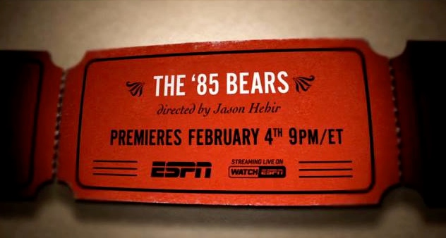
Are you persnickety about correct type and punctuation? I think most people who work in design are. Amy Siano, 4x3’s president and CCO, noticed a gaffe in a recent promo from ESPN — a single quote used where an apostrophe was called for (in the picture above, before “85”). Not cool, ESPN!
We all rely on spell check (a little too much) to police our spelling gaffes, but when it comes to punctuation, we still have to fall back on our own hard-won grammatical knowledge… or lack of it.
Preposterous apostrophes
Consider how common apostrophe mistakes are. We see it all the time in situations where an innocent “s,” trying to do the noble work of making something plural, is forced to get all possessive.
- 7s (a way of writing “sevens,” a type of rugby) typed as 7’s
- CD’s instead of CDs
- No Dog’s Allowed
Good typography and grammar is marketing 101
You can create a brochure, sign or magazine that throws out a word like perchloroethylene, every letter in place, but if you can’t tell your its from your it’s, you’re gonna sound like a rube. The Internet is full of pictures of carefully created signs that look good at first—until you notice that big glaring apostrophe error.
Do you have a typography (or punctuation) pet peeve? Send them to me at jimsturdivant@4x3.net, and we’ll publish them in a future post.

