4x3 Launches The Phoenix Theatre Company Website March 3, 2019
4x3 is proud to announce the completion and launching of The Phoenix Theatre Company’s new website.
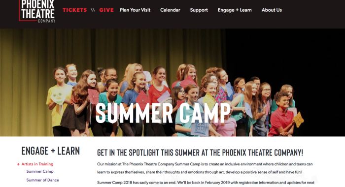
4x3 is proud to announce the completion and launching of The Phoenix Theatre Company’s new website.
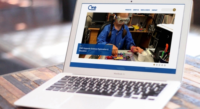
4x3 is proud to announce the completion and launching of the CWE Scientific Instrument website.
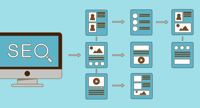
When GF&M Law contacted 4x3 for a redesign of their website, we worked closely with the firm to create a site that reflected the class and professionalism of GF&M but also was functional on all devices and SEO-friendly.
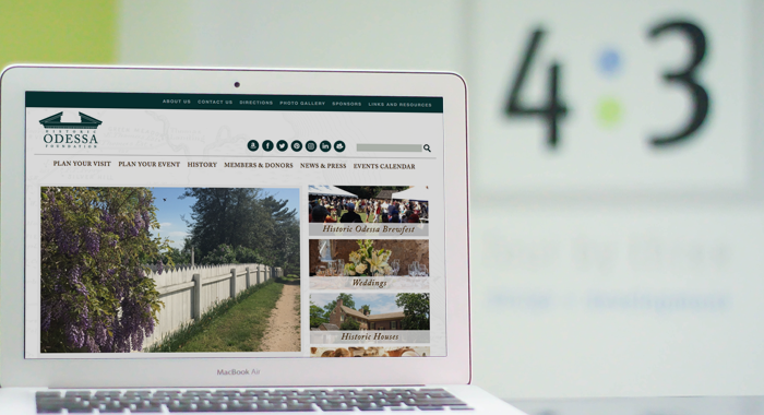
When approached by the Historic Odessa Foundation for a website redesign in 2010, 4x3 was tasked with implementing an efficient, user-friendly solution that prioritized content rich management and custom navigation. The resulting website design allowed visitors to clearly discover and understand Historic Odessa's wealth of information.
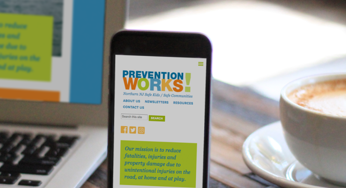
Back in February, 4x3 redesigned Prevention Works! website. The new site strategically-focused on responsive design and custom Google maps as functional modifications to increase organic SEO and visitors.

Relevant and timeless content is invaluable when developing a brand. 4x3 develops custom, fully functional sites to manage content in a SEO-friendly and organized manner.
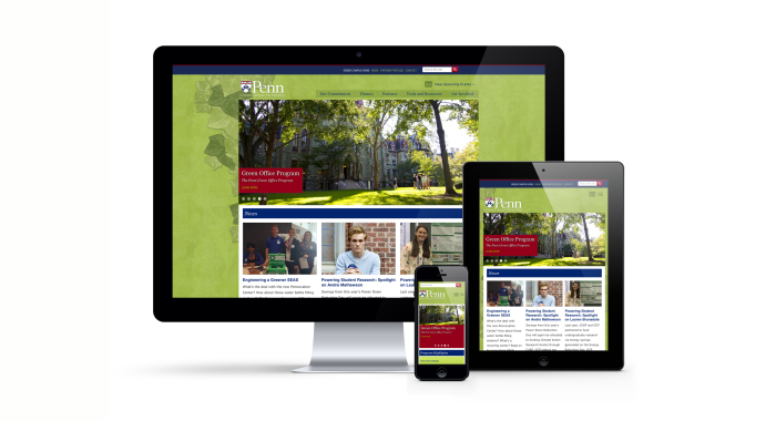
4x3 has been partnered with the Penn Green Campus Partnership since September 2012. Back then we created a new website with a Drupal powered content management system; and now we have redesigned the site once again to be responsive on all devices for greater visual impact.
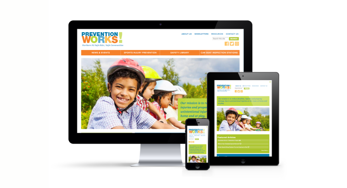
Back in 2013, 4x3 designed and developed a website for Northern NJ SAFE KIDS/Safe Communities. But it was time for an upgrade... so this year we worked closely with Prevention Works! to redesign their website.
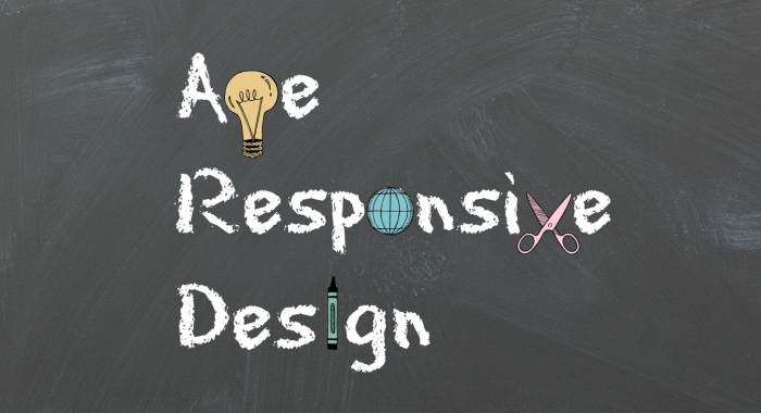
When we began the web design process the other day with a client, we stumbled across a new phrase in the RWD world: Age Responsive Design.

Ever wish news articles in Google search or Facebook feeds would load faster on your phone? Our benevolent Web overlords feel your pain. There’s a mini horse-race going on right now between Google and Facebook over which will attract the most publishers to their new content platforms designed to make loading articles lightning fast in iOS and Android.
Here at 4x3, we’re always looking for ways to do things better. The conversation today revolved around making e-newsletters more responsive. Since so many people open emails on their phones, it makes sense to set best practices for design and content that optimizes the reading experience.
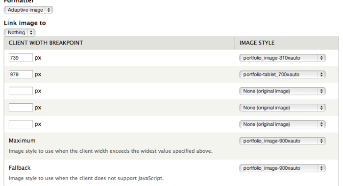
About a year ago, I programmed my first ever responsive website. I had heard of and seen them in action, but I never actually made one myself. It definitely was, and still is, a learning experience. My first few sites had some clunky and less than elegant responsive solutions in them. But in the past year, I’ve learned lots of tricks that make responsive sites easy to build and wanted to share.
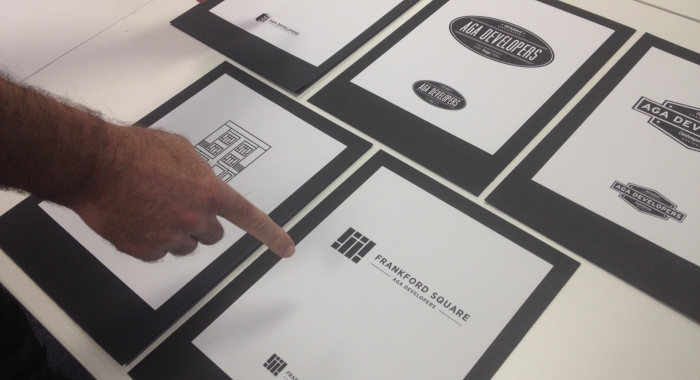
4x3 is proud to announce that AGA Developers has been added to our list of clients. We will be providing AGA Developers with a variety of services including website development and design as well as branding.

Recently one of our clients received an email with the subject line: "I noticed a problem with your mobile website."

I try not to be a pressure salesman, but it may be time to re-evaluate what our website is doing for us. Not just you our clients but 4x3 - our site - our focus - the future of our industry. In the past we have been offering mobile sites and responsive design as an option. And maybe we're just not selling the options hard enough. Maybe we're just not doing our job to make you understand what's happening and how very important is to keep up.
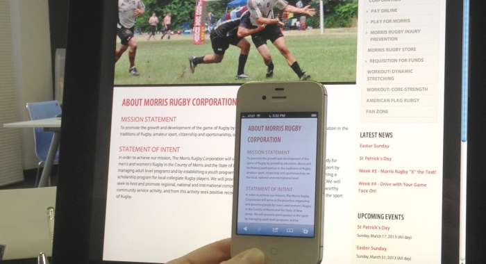
It seems inevitable right? More than half of all cell phone users in the US are using their mobile technology to access the Web. Over 30% of those users, use their mobile device as their primary source to access the Web. Increasingly, traffic is coming via social media, like Facebook, and Twitter, or email campaigns that users access through their smart phone or tablet.
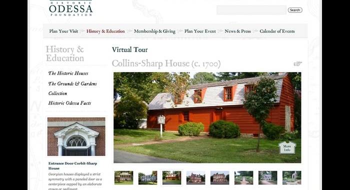
4x3 designed a dynamic site for the Historic Odessa Foundation that showcases the historical beauty of this uniquely preserved colonial town and its unique museum collection.
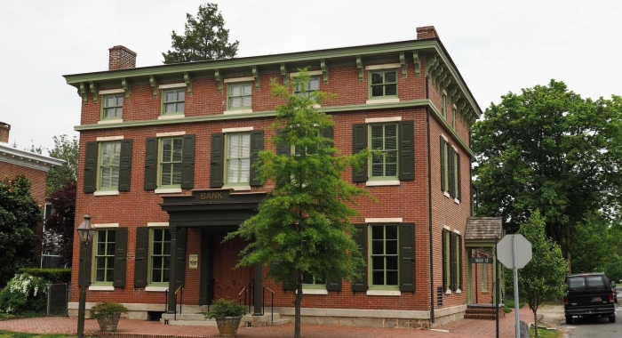
4x3 is please to announce their new client, The Historic Odessa Foundation. The project will entail a complete redesign of their current website along with the implementation of a customized Drupal CMS.